Why Does Email Development Have to Suck?
Explaining all the <tr>'s and <td>'s…
Published on
-/- lines long

First of all, if you're reading this because you unwillingly have to deal with email development, you have my deepest condolences for being one of the cursed souls condemned to suffer through this absurdity.
I regard email development as the filthiest job you can do with a laptop. Nothing makes sense and you have to repeatedly test everything like a lunatic, much like trying to scrub dried up shit off a bathroom wall.
Well, I hope the following will shine a light on this whole mess, give you useful advice, and relieve any potential suicidal thoughts you may be having.
What is Email Development?
In theory, developing emails should be very similar to developing websites. An email is essentially just an HTML document, like a web page, except it's visualized in an email client, rather than a web browser. However, both are capable of rendering, which is the process of turning HTML code into text, rectangles, and images, i.e. the visualization of the content.
If you were a time traveler from 2005, developing websites and emails would've felt very similar indeed. Both browsers and email clients rendered HTML pretty much the same way and had the same functionalities. But while web standards(opens in new tab) evolved and browsers started implementing them, email clients didn't change much.
When developing websites nowadays, we have support for tons of cool and productive features, such as grid(opens in new tab), flexbox(opens in new tab), dark mode(opens in new tab), transitions(opens in new tab), and they are supported in all major browsers. On the other hand, in email clients, these features are:
-
Not supported at all
-
Not working as expected, or
-
Not available in all email clients
So if you want a reasonable portion of users to see your email as intended, let's say 95%, you have to stick to the most basic features of HTML and CSS. And even that isn't a 100% guarantee…
With that said, let's see why the most terrible practices in web development these days sadly continue to be the best practices in email development.
Why <table> Elements?
Email development is most notorious for its heavy usage of table elements and the never-ending string of <tr> and <td>. Why?
As explained in this article about rendering issues(opens in new tab), Microsoft Outlook uses the same rendering engine as Microsoft Word. This means that opening an email in Outlook is basically like opening a document in Word, so you have to get into the mindset that you're making a Word document, not an email.
You might think "wait a second, Word doesn't have many tools for layout and styling…" and you're completely right! But it does have tables. And only tables. Anything you want to be properly visualized must be a table. There's no other way. Deal with it.
To prove this, here's how a modern email from Apple looks like when pasted in Microsoft Word 2013:
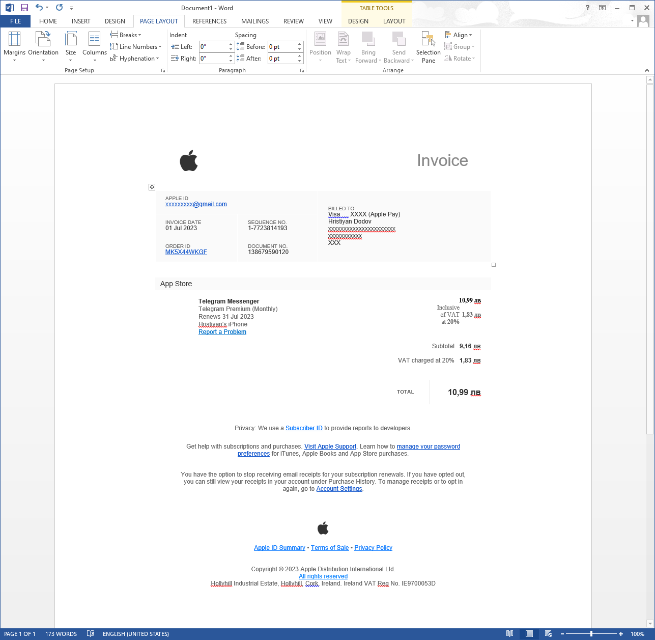
Looks surprisingly not totally broken, right? Well, it's only because the HTML of that email contains 75 occurrences of <tr> and 122 of <td>. Check the HTML(opens in new tab) and see what a mess it is.
Why Inline Styles?
Like a regular HTML document, emails can also have CSS styling, and if you're a reasonable person, you'd put them in the <head> tag of the document. It'll work pretty decently, according to the "Can I email…" support pages for <link>(opens in new tab) and <style>(opens in new tab).
You could do it "the right way", send your email, open it, and be pleasantly surprised that it looks as expected. But users not only receive emails — they write emails as well. And they not only write them — they also forward them.
So what happens when you forward an email? Plain and simple — everything in the <head> gets removed, as answered on Stack Overflow(opens in new tab). If you put any styles in there, Gmail will gladly remove them for you.
The only styles that don't get removed are inline styles. Therefore if you want your email not to look completely blasted when it gets forwarded, you have to use inline styles.
Take the following email from Apple that I've forwarded:
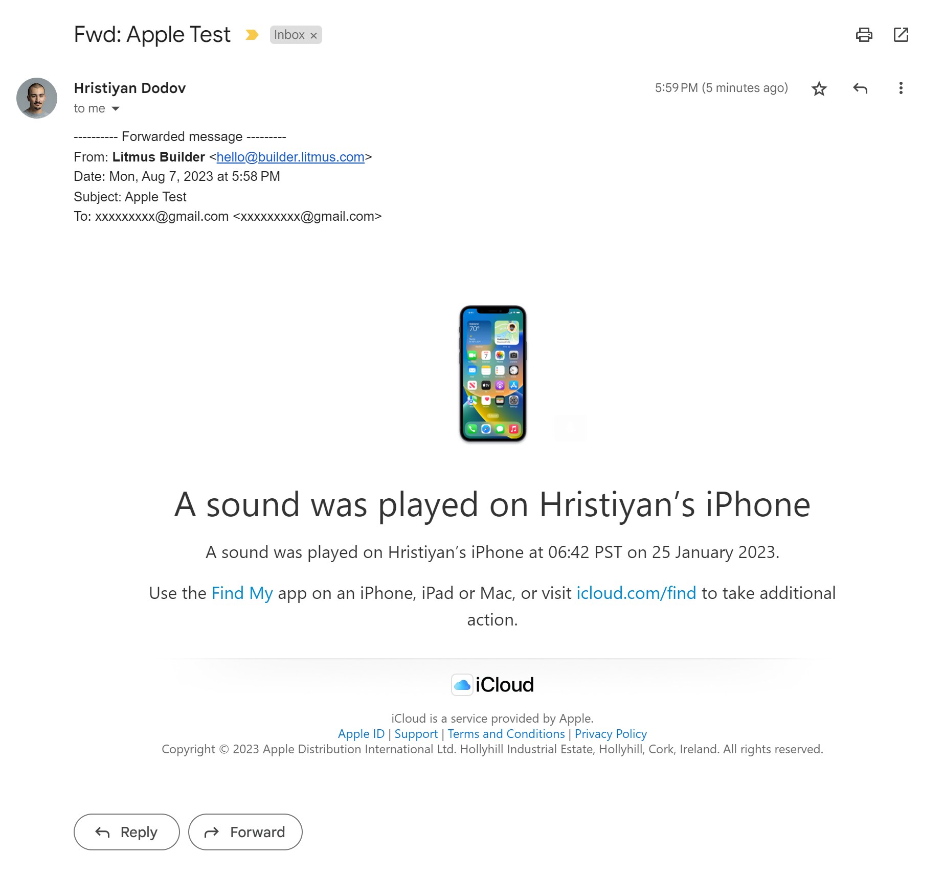
Nothing wrong with it, right? Well, that's because it has 40 inline style attributes. Check the HTML code of that email(opens in new tab) to see for yourself.
Let's remove the inline styles now. Check the updated HTML(opens in new tab). In your browser, it'll look pretty much identical because the same styling that the inline styles provided is replicated in the <head>, as a fallback. However, because these styles also get removed when the email is forwarded, we end up with no styles:
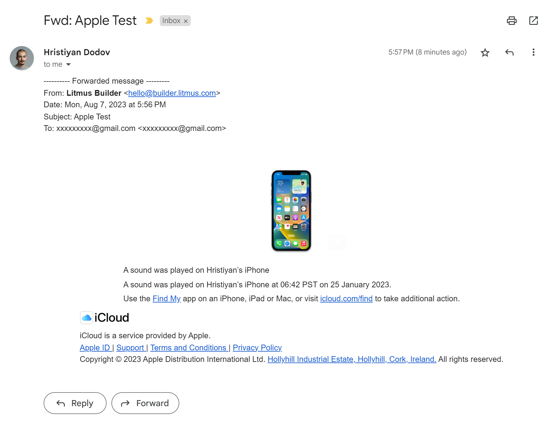
As you can see, the heading is messed up, the footer, the spacing… Obviously, that sucks, but there's a somewhat logical reason for it — security. Email clients preprocess HTML before rendering it to make it safe, as explained in the Litmus blog(opens in new tab).
Nevertheless, if you want your emails not to look like a failed science experiment when forwarded, you have to be a CSS sinner and spray them with inline styles.
Color Inversion
In website development, we use prefers-color-scheme(opens in new tab) to detect if users are viewing in dark mode and change the color palette of the page accordingly. Most email clients don't support this(opens in new tab), of course, because they live 20 years in the past. Others, like Apple Mail, do support it. But Gmail takes a different approach…
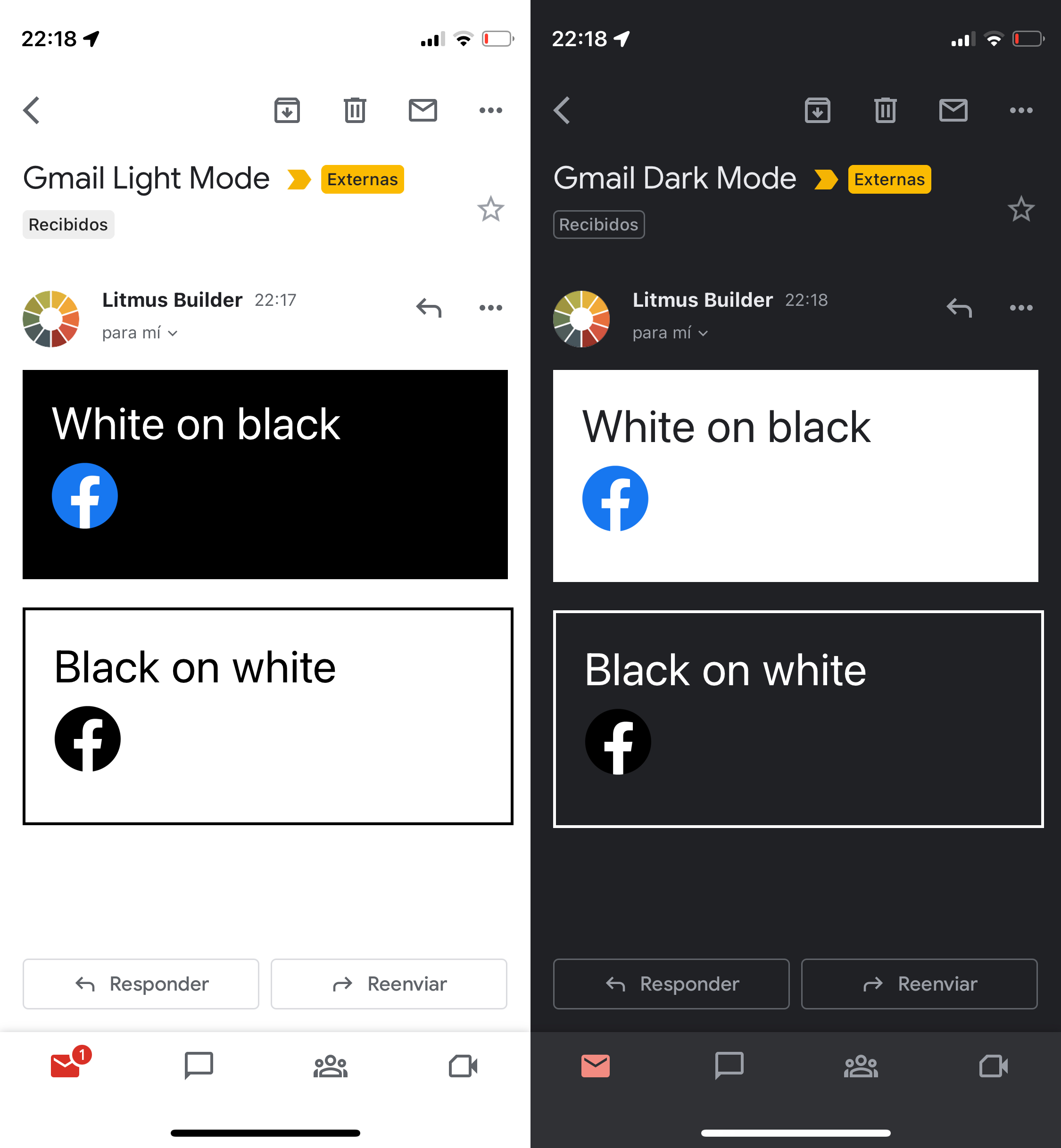
Google has decided that your disgraceful designs can be mathematically predicted and has taken away the heavy burden of having to think about color palettes and design in general.
When in dark mode, Gmail simply inverts all the colors in your email — backgrounds, borders, text colors, and so on. Look:
Sadly, this cannot be controlled, nor detected, in any way. You just have to pick colors that work well when inverted and images that work well with both regular and inverted colors. Have fun!
Full Width Content
On mobile, you might want to have edge-to-edge content, similar to how you might have it in a website. That's possible in most mobile email clients… except for Gmail.
Gmail puts an annoying 16px padding on the sides of each email:
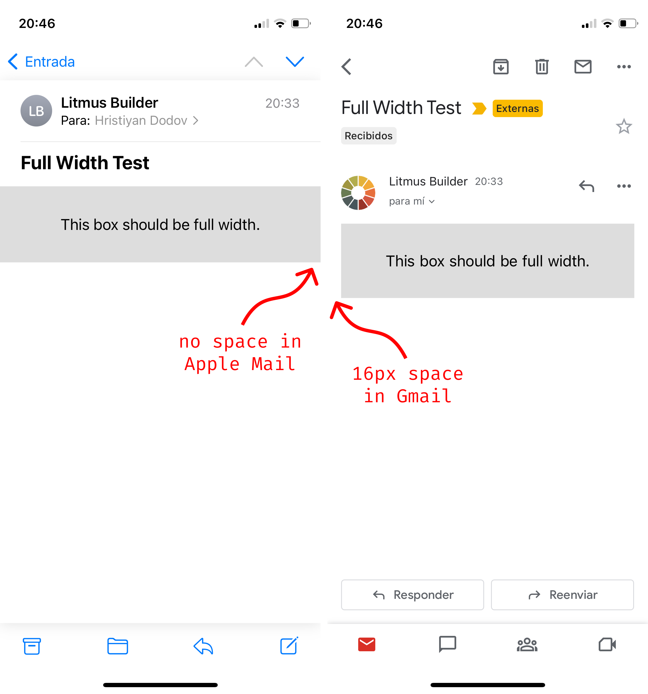
You can't remove this padding. No, not even with margin: 0, padding: 0, and !important all at once. It's just there. You can't detect it or do anything else about it. Screw yourself.
Custom Fonts
Perhaps one of the most essential parts of your branding is your font. Naturally, you'd like to use it in your emails as well, right? You absolutely can! But not in Gmail.
There simply is a lack of support for @font-face(opens in new tab) in most email clients, Gmail being one of the ones with highest usage.
As explained on Stack Overflow(opens in new tab), you can only rely on fonts that are native to the device's operating system. Hope your brand works well with Arial and Times New Roman! 🤞
Responsive Images
You might want to have one image for desktop and another for mobile, purely for aesthetic purposes. Assuming you've read MDN's guide for responsive images(opens in new tab), you first thought might be to use srcset(opens in new tab)… But that's not well supported(opens in new tab), of course.
To get around this, you just have to use multiple <img> elements and hide them accordingly using media queries. However, if you haven't caught on already, this also has its pitfalls:
-
In Outlook, you can't simply add
display: noneto an<img>element. You need to wrap it in a<span>, for example, and hide that. Check note number 2 in the support table fordisplay: none(opens in new tab). -
There is no support for nested media queries(opens in new tab) in Gmail:
@media (max-width: 600px) and (prefers-color-scheme: dark) {
	/* only show on mobile in dark mode */
	.something { display: block }
}
You have to invert your logic, use two separate media queries, and rely on CSS cascading to override previous styles:
/* always show… */
.something { display: block }

/* …but hide on desktop… */
@media (min-width: 601px) {
	.something { display: none }
}

/* …and in light mode… */
@media (prefers-color-scheme: light) {
	.something { display: none }
}
As you might guess, this gets confusing pretty quickly.
Other Minor Notes
If you've read this far and you're still not convinced that email development should be treated as method of torture, here are some more examples from the endless sea of nonsense:
-
There's no table padding in Outlook. When you set CSS padding on a
<table>, Outlook simply applies that padding to all<td>elements inside the table instead. However, at least you can override that padding in the<td>elements themselves… -
Most email clients scan email addresses and phone numbers in your content and convert them to blue
<a>links that look terrible. You have to wrap them in<a>tags yourself in advance and remove the styling:<a style="color: inherit; text-decoration: none;" href=""> [email protected] </a>If the address is already a link with an empty
href, it won't be processed by the email client. -
For Outlook, list items should be separated with margin and the list itself should be indented with margin as well:
<ul style="margin: 0 0 0 18px; padding: 0;">
	<li style="margin-bottom: 24px;">foo</li>
	<li style="margin-bottom: 24px;">bar</li>
	<li style="margin-bottom: 0;">baz</li>
</ul>
The last item should explicitly have zero margin to avoid extra space on the bottom.
The Solution?
While this might sound uninspiring — lower your expectations. Seriously. If you're working with designers, let them know how complicated everything is. Tell them all about the aforementioned constraints. Ask them to understand how tangled everything is and to take those constraints into account when designing.
However, even if you manage to negotiate simpler designs, you still need some sort of way to deal with all of this mess. And don't ever think you can write "clean code" and have everything neat and tidy and working. Something somewhere will not work. That's about the only guarantee you can have in all of this.
This is where projects like MJML(opens in new tab) and React Email(opens in new tab) can help. They attempt to abstract away all those obscure email client quirks. With MJML, for example, you can forget about all that complexity and creating emails becomes straightforward:
<mj-column>
	<mj-image width="64px" src="/assets/logo.png"></mj-image>
	<mj-divider border-color="#88846f"></mj-divider>
	<mj-text font-size="24px" color="#f8f8f2">
		Hello World
	</mj-text>
</mj-column>
It's a lot less painful, isn't it? No need to drown yourself in <tr> and <td> because MJML handles that in the background. Play around with it in the MJML playground(opens in new tab) and check Josh Comeau's article for a wonderful HTML Email workflow(opens in new tab).
Conclusion
Unlike web browsers, which conform to web standards, email clients answer to no one. Email development sucks because many of the modern features we rely on when building websites simply aren't supported for emails. This forces us to use legacy technology and think about countless edge cases.
Emails aren't built like websites, so don't design them like such. Have simpler layouts and use a project like MJML that abstracts away all of the headache. You'd be better off.
You can NOT outsmart email clients.